SpaceShipAPPS — developers of mobile apps
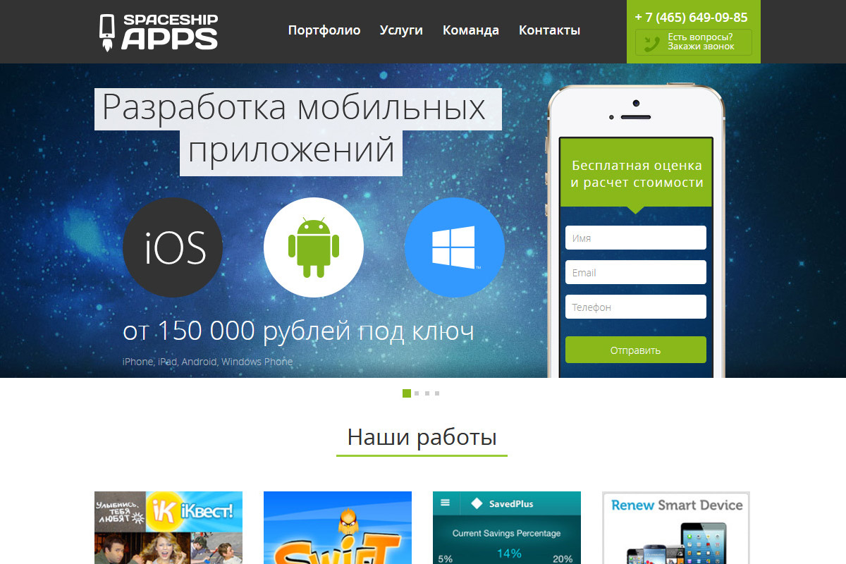
The landing should consist of:
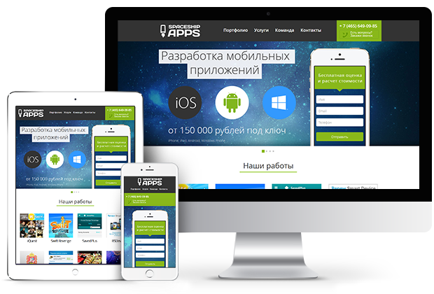
During the layout work, we considered the client’s wishes regarding the website’s behavior on mobile devices:


Do you want to update your website or create a project from scratch?
Leave an application - we will turn your ideas into reality!